
The Art of Pairing Wainscoting and Wallpaper: How I Design From the Wall Up
One of the questions I get asked most often is how I decide on wainscoting height and wallpaper patterns, and how I know when they work together. The honest answer is that I rarely decide at my desk. I decide on site, with samples in hand and a pencil on the wall.
It sounds simple, but that moment — standing in the actual room, in the actual light, drawing a line on the wall at different heights — is where the whole design comes alive. A line at 36 inches feels completely different from a line at 48 inches in the same room. The ceiling feels higher or lower, the room feels more formal or more relaxed, the wallpaper pattern above breathes differently.
Here is how I think through these decisions, and what you can see in four rooms from one of my favorite recent projects.
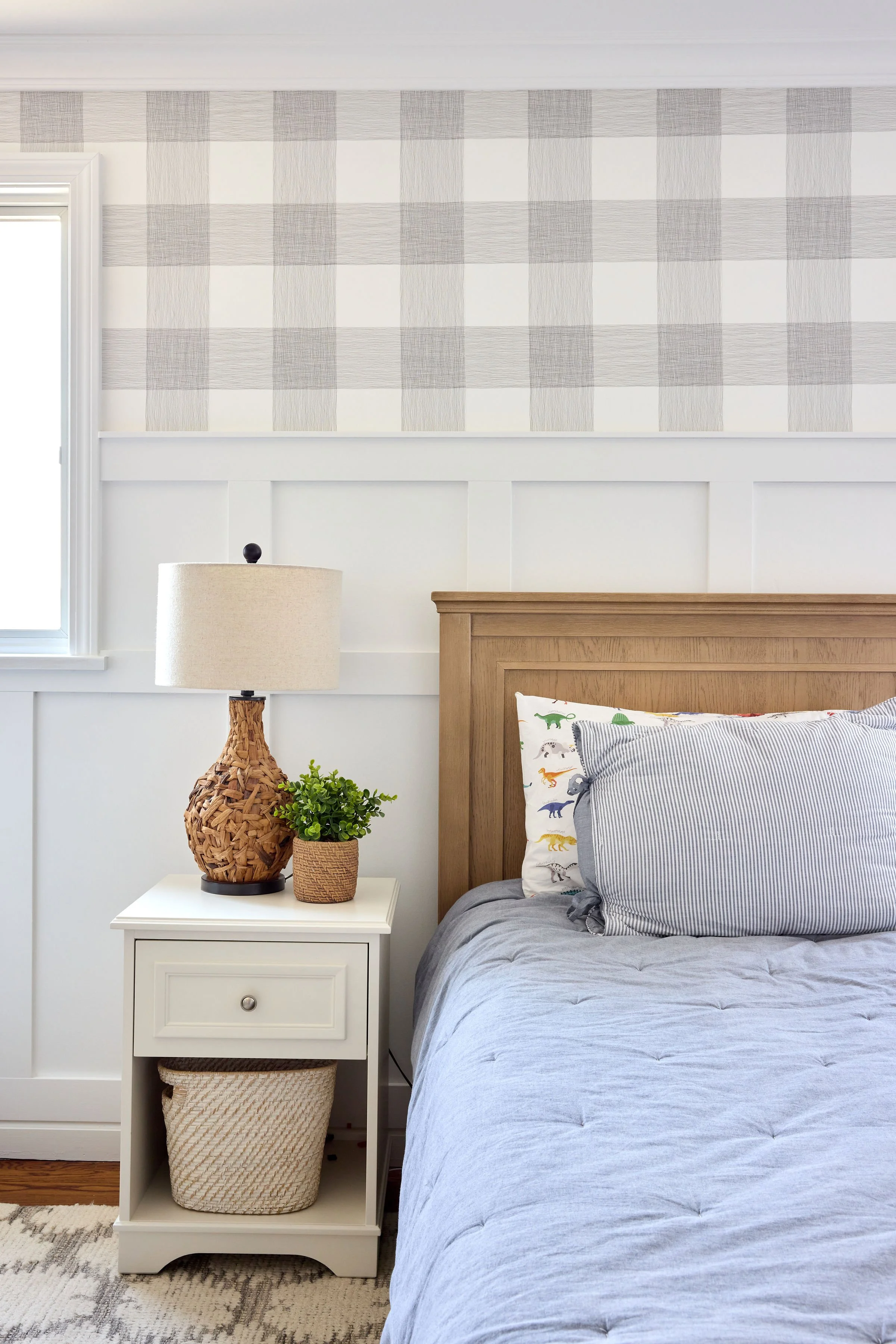
The Boy's Bedroom: Bold Plaid, Low Profile Wainscoting
In the boy's bedroom, using a large scale grey and white buffalo check wallpaper paired with relatively simple board and batten wainscoting at a lower height. The decision was deliberate. The plaid is bold and graphic, and letting it dominate the upper portion of the wall gives the room energy and personality. The wainscoting below acts as a clean white anchor, grounding the pattern without competing with it.
I left the ceiling plain white. With a pattern this strong on the walls, adding it to the ceiling would have been too much. The white ceiling gives the eye a place to rest and keeps the room feeling light even with a dominant wallpaper. The natural oak headboard, simple nightstand and casual layered bedding all let the wallpaper be the star, which is exactly the point.
When the scale of a wallpaper is large and the palette is graphic, simpler wainscoting is almost always the right call. The millwork should support, not compete.
The Girl's Room: Delicate Pattern, Ceiling Included
The girl's room is where I took the biggest swing on this project. I used a Serena and Lily wallpaper with a soft, delicate lavender botanical print, carrying it up the walls and across the entire ceiling. The effect is completely enveloping, like stepping inside a garden.
This only works because of the pattern itself. The print is small-scale and low in contrast, a whisper rather than a statement. It wraps the room in softness rather than overwhelming it. The wainscoting here is a classic raised panel design at a slightly higher height, which adds formality and architectural detail that balances the dreaminess of the pattern above.
The ceiling treatment is something I always consider on projects with sloped walls or in children's rooms. When a pattern is delicate enough and the room is intimate enough, papering the ceiling creates a sense of wonder that paint simply cannot achieve. The key is saturation and scale. You need a pattern that can repeat across a ceiling without becoming dizzying.
The white Jenny Lind bed, soft bedding, and a single sweet stuffed animal are all that is needed in a room this thoughtfully designed. Less is more when the shell is doing the work.
The Playroom Nook: Saturated Color, Architectural Drama
The blue plaid playroom under the eaves is one of my favorites. The angled ceiling gave me something to work with that most rooms do not offer, and I made the most of it by carrying the wallpaper continuously up the walls and over the entire angled ceiling. The result is a cocoon. A fully immersive space that feels like its own little world.
The wallpaper here is a saturated, medium scale plaid in a bright cornflower blue. It is confident and joyful. I paired it with a classic painted wainscoting at a height that aligns with the base of the angled ceiling line, so the white millwork frames the room at eye level and the wallpaper takes over completely above. The white chair and matching blue pillow are simple by design because the room does not need anything else.
The Entry Foyer: Sister Parish, Wainscoting as Architecture
The staircase and entry foyer used a Sister Parish wallpaper, one of the great American wallpaper houses, known for its timeless charm and refined patterns. The foyer is the first thing you see when you walk into this home, and the wallpaper sets the tone for everything that follows.
Here the wainscoting does the heaviest architectural lifting of any room in the house. The board and batten runs up the staircase wall following the angle of the stairs, and the paneled wainscoting at the base grounds the entry with elegance and detail. The dark stained handrail, white balusters and natural wood treads with a sisal runner all work within the palette the wallpaper establishes.
In a foyer or staircase, wainscoting is not just decorative. It is protective and practical. It takes the daily abuse of traffic, bags and hands at the most vulnerable height and does it beautifully. The height and style of the wainscoting in this space was determined by standing at the bottom of the stairs with a pencil and testing where the eye naturally lands, where the pattern above has room to breathe, and where the millwork profile feels proportional to the staircase itself.


What I Want You to Take Away About Wainscoting and Wallpaper
Every one of these rooms uses wainscoting differently, and every wallpaper was chosen with the wainscoting in mind, and vice versa. The two are in a constant conversation with each other and the decisions I make are about:
Scale. A large scale pattern needs simple millwork. A delicate pattern can handle more elaborate detail.
Saturation. A bold, saturated pattern often calls for a plain ceiling. A soft, low contrast pattern can handle wrapping overhead.
Architecture. The bones of the room tell you what the wainscoting wants to be. Angled ceilings, staircase walls, and intimate nooks all have their own logic.
Height. I never determine wainscoting height from a drawing. I always test it on site with a pencil and samples. The difference of a few inches can completely change how a room feels.
Designing from the wall up is one of the most transformative things you can do for your home. If you are thinking about a project and want to explore what wallpaper and millwork could do for your space, I would love to talk.
Kelsey Peterson is the principal and founder of Style and Space Interiors, a design studio based in Sleepy Hollow, New York. Photography by Julia D'Agostino